Thursday 29 October 2015

Mindmap for my idea

For this lesson we had to chose one of one of Queen Elizabeth 1 ladies in waiting, and create a contemporary one, and make story up of what she has done and who she married, and what sort of person she is.


  • I chose  Elizabeth Brydges, who married Sir John Kennedy, but it didn't end well as it was rumored he was already married.But she did become the second most powerful women eventually.


http://www.trystancraft.com/costume/2011/07/15/elizabethan-hairstyles-1560-1600/


She was born in 1574, daughter of Giles Brydges, who was a rich baron. She did get the attention from Robert Devereux, that was the queen's favourite. 

For the design of her, i was thinking a powerful colour to show how she was and the emotion that she went through. The pose would be important, like looking straight into the camera, or showing a powerful pose, that you mean business and want to protect the queen and herself.


http://www.eiffelinseoul.com/2009/10/han-ji-hye-does-vogue-korea.html?m=1

Taylor Momsen appears in a new photo shoot for this month’s FHM MagazineTaylor Momsen for FHM magazine in March 2012, photographed by Zoe McConnell.
http://www.mirror.co.uk/3am/celebrity-news/taylor-momsen-gives-rudest-interview-672853


Red or Dark Green, that would show wealth, as it is the colour that reminds you of money. Just colours that stand out of showing power and authority.

For the make up a spiky texture or just very striking, like lightening or thunder effect.The hair i had a idea of a mohawk style, but the hair curled over into the middle, like massive pin curls rolled over in the centre part of the head, maybe going all the way over the forehead.


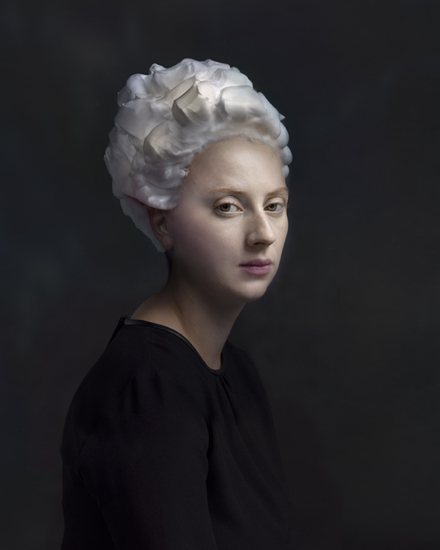
With the hair i want to make it bigger and make a big impact on the viewer, i like the smoothed down curls, which reminds me of the 20s style, but i could make the curls bigger and roll over more. It is a gothic look, but i dont want to go to far in that direction, otherwise it would be to cliche.

http://weheartit.com/entry/group/307221


extreme hair!: 
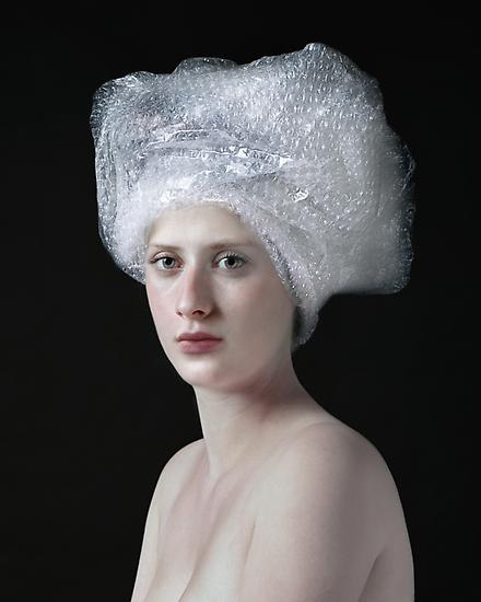
This gives me inspiration and shows a good idea, of what i wanted to to do the hair anyway, but not as intricate and as many, I also wanted the hair to roll over into the hair, instead of up like this. They do remind me of bubbles though, which i think 
is interesting, but not something i want to include, because that seems child like.
https://www.pinterest.com/pin/215539532140753804/


I'm looking at what she would wear as well, such as i like the red colour idea, as it brings out her powerful side and how she would feel.


I like the look of Lydia's wedding dress in Beetlejuice, although it is very 80s and kind of over the top and not that nice,the colour is bright red, but also the gothic side, which i think would be a good starting point and it really focuses on that, which is why i think it works.


https://www.pinterest.com/southpawstudios/halloween-247/


Interesting information about ladies in waiting in Elizabethan era: http://www.elizabethan-era.org.uk/lady-in-waiting.htm


Tuesday 27 October 2015

Renaissance videos and Paintings/Images


A video on you tube that has music and architecture from 16th century renaissance in different countries. I like how the music can inspire even a idea and to get in a mind set of what would work, when making a design for makeup and hair, as it shows a lot of art and famous people at that time.


https://www.youtube.com/watch?v=28HKJkfGZIY


Superheroes and sci-fi characters given a 16th century makeover


A video about if superhero were in the 16th century and what they would look like. I thought it would be good to include this, as i thought it would be interesting way of thinking, when researching different things for the Elizabethan era. The is various sites were they have done this, with all the images on them.


https://www.youtube.com/watch?v=74qQ6QNXBks


Available on: http://www.authorstream.com/Presentation/chay232003-1926469-music-renaissance/

Available on: http://www.telegraph.co.uk/culture/culturepicturegalleries/11240369/Superheroes-and-sci-fi-stars-given-16th-century-makeover-by-Sacha-Goldberger.html?frame=3111205

National Portrait Gallery


Yesterday i went to London and looked at the National Portrait gallery, there was a series of paintings there of Queen Elizabeth 1 and many others, but i focused on the Tudor ones. I thought they were really interesting with so much detail close up. The other i thought wasn't so good close up was the Anne Boyeln portrait, i love the painting, but up close i don't think it looked as good.


This was a painting of Queen Elizabeth 1 and the year was 1533-1603. The artist is unknown, but i like this painting, as it shows her looking very much in authority and with how young she looks, but when they were painted she did not pose for them, they used templates over and over again on most of her portraits.The clothing is amazing and really shows the upper class and how much she loved clothes and colour.


Queen Elizabeth 1, painted by unknown English artist. in the year 1533-1603 and shows her looking very handsome, but it does show that the portrait was not done by life, but done for what the queen would have looked like in her early years of reign. I like how she looks masculine, with the clothes, which does show her in authority again, which is what she wanted to do, but still look like she can be compassionate, where is looks like she is slightly forming a smile.

Health and Safety in the workshop practices

Health and Safety


First you have to wash hands before you handle the make up in the kit and before you touch someone else's face or anything.

Always say to them when you are going to wash your hands

Always clean your brushes after you have used them every time, so they don't get mixed in with the other colours.

No double dipping, always scoop the product with a wooden stick and place on hand use it from there, but if it is powder, scoop some onto the paper towel and use from there, which comes from a roll of it.

Cover the person with a paper towel or cape around them, so doesn't get on clothes or anything.

First before the makeup, you need to make sure you cleanse, which gets ride of grime and any type of make up, and you should use baby buds for around the eye area.

Toning, that prepares for moisturizing

Then Moisturizing.

Always have hair up away from the face.

Ask them if they wear contact lenses, are allergic to anything.

Don't ask them to get rid of all the eye make up themselves.

Use non fragrance remover, and for all skin types.


Day Of The Dead Make Up Practical

Today i learnt how to do my own version of the Day of The Dead make up, which is a Mexican holiday, that honors the dead. It is a tradition that the celebrate on November the first and second. The make up is called sugar skulls, but it is done all over religious parts of the world, that is catholic.


An example of a Sugar skull make up that i found and liked. Because i like how it is black, but not plain looking, they have added Jewels and a shimmer to it. It is different than some of the other i have looked at, as it is not as colourful. It was on someones blog on the internet, where it was orginally from.

http://thelonepanda.com/2015/07/16/excuse-me-while-i-go-knock-myself-into-a-coma-someones-invented-clown-contouring-insert-puke-emoji-here/


 I had a go at it, and i designed my own version. It was awkward as i have never done this look before, and on someone made me nervous. But i think it turned out well, but i wish i had more time on it, to add more details, to make it stand out more. i like the eye part as it is blended well, with the black into the blue, creates a good shade under and on the lid of the eyes. I should practice on doing my precision skills, as my hand was shaking a lot, especially when doing the lips. I think blending would help it more and shading on the forehead and chin.


I added some more blue shade under the cheekbone and the black around the eye, then blended that, but when doing so, some of the white base did come off, so i need to experiment more with blending, even under the cheek bone as well.


Product Used: Kryolan Supracolor Palette in
White
Blue
Black


Saturday 24 October 2015

Face by Holition

I was researching on the internet museums about Make up in London, or anything to do with that such as Elizabethan cosmetics, and i found a article about a new technology from a company called Holition, where you can try the makeup on yourself to see what it would look like on a screen. It is a virtual reality app called face. The make up is from Alexander Mcqueen's fashion show Spring/Summer 2001 and 2003, and 2008. It works like a mirror and it is basically a app where the make up fits on perfectly to your face.


http://www.forbes.com/sites/rachelarthur/2015/05/29/you-can-try-on-legendary-alexander-mcqueen-make-up-looks-with-this-virtual-tool/


https://www.youtube.com/watch?v=gixfWV-wRQU


A, Rachel. 2015. Available on:  http://www.forbes.com/sites/rachelarthur/2015/05/29/you-can-try-on-legendary-alexander-mcqueen-make-up-looks-with-this-virtual-tool/ (24/10/15)

Face Charts


This face chart was a design i made up, and it was eye shadow that stood out on the eyes, and nude lips, so that it wasn't overwhelmed. The product used on the eyes was Mac Cool Neutral eye shadow palette, in Black Tied, with Deception, which is a shimmery brown colour right around the eyes, then i used a angled brush to do the brown, then the black with a soft brush to smudge it towards the edge of the face, but did use Brun, that is a dark brown mixed in with it. For the lips i used Kryolan Lip Rouge Mini Palette Number LCP653, which is a light shimmering pink colour, which is nude looking once put onto the lips on the face chart. On the skin and on the cheekbones,and as highlighter, i used Kryolan Glamour Glow Palette with the colour Blush Peach, which is pink in the palette, but once it is on, gives a more peachy tone to the skin.

I like the way the eye shadow looks like a superhero mask, but very sultry a the same time. I could work on the the way i have blended it, as the upper part of the face has to much on it, to be natural. I think having the light colour lip makes the makeup stand out more.


This is the one i like the best,as it does look natural and more fashion photography inspired, and also how the eye shadow is shaped is like how they are doing it on catwalk fashion shows at the moment, with it being more rounded and the colour bold. I wanted the lips to be gold,as i was inspired by gold leaf with how it is green, then covered with gold, which is what i wanted to show in this look. The skin would be more dewy and the blush would be light and slightly bronze. 

For the eyes i used Kryolan Supracolor Palette, in Gr42 a dark green, which is grease based and easy to glide on, but you can see the paper under neath, as it would look better on a person. For the lips i used the same palette, but Gold. The cheeks i used Kryolan Glamour Glow again, in Bronzing Agais, which is another shimmering brown, when not on skin, but when on it is natural, but on here it have not blended it as well as i hoped. 

What i like about it is that how it natural, but bold at the same time, and as soon as you see it, you focus on the eyes. I didn't want to use all the gold all over the lips, as i thought it would ruin it, and be to much, but like this it makes the lips look bigger stand out against the green, so that it does look organic and kind of reminds me of a goddess who has the spirit and will of the snakes, which she is the queen of them, and is very tribal looking.


Foundation and highlighting for photoshoots


In the lesson we had to Cleanse, Tone and moisturize, then adding primer, which was Illamasqua Matte Primer, as i like how it is easier to glide on and is smoother on the skin. After that i added a foundation from kryolan's Ultra foundation palette and i thought that was good and i like it better than normal foundation, as it is more cream based, but what i don't like is how it doesn't hide blemishes on skin very well, but it is more natural.


After that we had to highlight, which was just getting the same colour and using that in place, such as on the side of the eyes, on the nose, chin, then you need to blend it into the skin, after that is sort of contouring, on the apple of the cheek, then blending that in, then on top illamasqua loose powder buffed in on the top, which creates a really natural look.


I think i do need to practice more on it, as applying it with the brush made a lot brush lines, where i had applied it, also i should have moisturized the skin before hand, as the skin was dry and the foundation started to come off slightly.


Next time i need to cleanse, tone, then moisturize, and wait a few minutes, before applying the makeup, as it will just mixed in with each other and not work as well. For the highlighting i needed more time to do it, as i have never done it before and i didn't use enough that made it look like it was there, when using the blush, i didn't use enough again, and was not blended to my liking, i think it was just timing, but i need to practice that.


Tuesday 20 October 2015

Experimentation

I did a experimentation with things to make a cosmetic or makeup. What i did was try out eggs and  face powder mixed togther, and i put on the Kate head to see what would happen, and it put a smooth sheen on the face, and after a while some parts of the face went white. The other was a lipstick, that i made with two different types of lipstick, matte and gloss one, which made a dark pink colour. I think i should do more and even make my own lipstick. I just wanted to see what it would do, then i would get more materials to make my own.


Hendrik Kerstens


Hendrik Kersten is a photographer and he is dutch and started in 1996, where he photographs his daughter in various strange objects around her neck or on her head, which is what this series is about and i have chosen them, as they stand out to me and i would even experiment and try to do some of them. They do remind me of Elizabethan hair and clothing that they wore.


This looks like a head scarf wrapped around her head loads of times and even looks like how you would put a towel around your hair, when you have just washed your hair. The bubble wrap gives it a clear, see through texture to it, even reminding me of thick long hair on top of her head.


These remind me of paper that has been cut out to make shapes, it is very much like a Elizabethan ruff, which is why i included it on here. I like how her whole look is that way.


All these images show objects that tell the viewer something that the model is into or the photographer himself. This reminds me of a bow that you wrap around your hair when it is styled.


I like this, as it is form that has been formed to look like hair and i think it looks slightly Elizabethan or even a wig in that era. It stands out to me, where the shape looks 3D.


All available on: http://www.danzigergallery.com/artists/hendrik-kerstens/2


Monochromatic Make Up look

Today we used a white base as the starting point then had to have a monochromatic look on top of it. for the base i used Kryolan Supracolor palette in white with a brush, then buffed it in. For the blue i used the same palette and is grease based, so i thought it was easy to use and blend. I used two different shades, i made the dark blue with a black mixed in, then for the light blue, some white.


The lips are the same light blue blend with white and then made it messy on top with the dark blue blend with black, so it looked more graphic.

I like the shape of the colour around the eye, as it looks very flowing and brings a nice effect up from the eye to the edge of the face.


It was my first time putting make up this way on someone properly before, so i think i do need to do more work on it, i did feel nervous, as though i would do it wrong. With the lips i did make them to big with the colour, so they did look clown like, but i made it look better with the graphic messy lines that i did with a brush.


Tools Used

Lip Brush
Kabuki Brush
Powder Brush
Large Foundation Brush
Eyeshadow Brush


Monday 19 October 2015

Contemporary portrait that suggests wealth through the objects that surround the sitter and the background


In this image i think it shows wealth in the accessories that she has on and the way she is posed, like she knows what she is doing. The hair is hair and a red colour, which does remind me of that, but a more contemporary style, which the pale face and red lips, brings me back to it again. The clothing seems more masculine, which shows her looking like she means business. Her hands are introduced in the image, which is like the Elizabethan portraits, where she is holding her jacket, that makes me think that she is trying to make a statement with the bold red clothes, and is holding it, as if to say look at this.


Both images in Elle Magazine, November 2015 issue and they are advertisements, but i thought they showed the best pose and symbolism

http://www.elleuk.com/


The other image i have chosen reminds me of Elizabethan with the clothing, as it is a dress and has a ruffle type material on the front, also the hair,as it is curly and put right back off of her forehead. The wealth is symbolised in the expensive jewely she is wearing, which are the bracelets. Her hand is put in it to show the accessories, but doing that remind me of Queen Elizabeth 1 portraits, where she always had her hands in it, but a modern way of doing it, especially the pose, where she is standing side on, with her head tilted to one side, looking at the camera.


Sunday 18 October 2015

Makeup testing

Bourjois Blusher 12hr comes in a push bottle, but it felt easy to put on, but the blusher felt kind of wet like, it says aqua on the bottle, so that you know it does feel wet and you need to leave it to dry on your skin, which is why it is easy to put on. In the push bottle it is new design and i feel like i wouldn't want to use it on my cheeks, like a cream, meaning you need to rub it in.
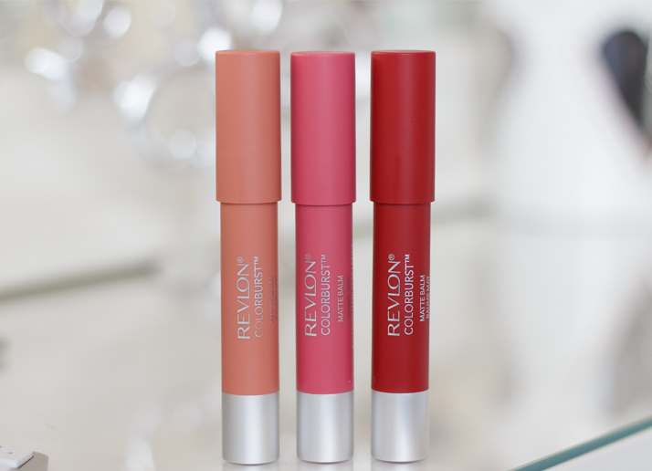
http://www.reallyree.com/2015/04/bourjois-aqua-blush-review-swatches.html


Revlon Colorburst Matte Balms in Complex, Elusive and StandoutI really like these matte lipstick from Revlon, they are really easy to use and just glade on. The colours are so rich and bright. and i like them better than the liquid ones. Even when it is matte, they have a velvet feel to them when they are on your lips. They do not last that long, but when you put them on they are cooling on the lips and smell good.


http://www.ysislorenna.com/2014/02/revlon-colorburst-matte-balms-review-swatches-photos.html


This product felt hard to rub into skin and felt dry. It is a corrector so maybe that is why, but i would try it, i just think it would not work as well on people who have a lot of blemishes or spots, like me, because of the hardness of rubbing it in, but i would stick to what i use already. It seems like it would be a matte finish on the skin, to make it appear smooth.


http://www.bamgaga.com/10-adimda-serenay-sarikaya-makyaji/13495


Saturday 17 October 2015

White Make up Experimentation


For this lesson i had to use makeup from my kit to create a Elizabethan looking style on someones face, and first i cleansed and toned the face, then used Illamasqua's Satin Primer on first, then the Kryolan Supracolor palette using white, but as it a grease based, when putting it on top of the satin primer, it just came off again, and peeled, especially when putting the illamasqua loose powder on top, which when i do it again i will not use that, but it is all experimenting. The whole look, looked good anyway and really showed the Elizabethan era makeup look


Available on: http://www.illamasqua.com/

Available on: http://beautyholic.me/blog/kryolan-professional-makeup-haul/

Wednesday 14 October 2015

Book of Hair (A Cultural History)

I was looking up about Elizabethan cosmetics and i found this book on Google books, about Hair in the Tudor/Elizabethan era and i thought it was interesting as it talks about how the queen had her hair in paintings and day to day, also other tudors at that time.


Available on: https://books.google.co.uk/books?id=9Z6vCGbf66YC&pg=PA115&lpg=PA115&dq=elizabethan+cosmetic+ingredients&source=bl&ots=YL2aDWj5oc&sig=lPR_qHEUml4xFHR6CkkCE5Qn7Sg&hl=en&sa=X&ved=0CB8Q6AEwADgKahUKEwiG9sbp1cLIAhVD2RoKHVSYARw#v=onepage&q=elizabethan%20cosmetic%20ingred
ients&f=false


Elizabethan Make up and Cosmetic ingredients

Make up 

White Chalk
White Lead
Egg
Vinegar
Cerise
Cochinal
Mercury
Ceruse
Vermillion
Belladonna
Madder


The white chalk or lead was used on the face to get a smooth finish that was mixed with Egg and Vinegar, that was then put onto the face and neck, so that it was very white. Cerise was white powder mixed with red colouring to redden the cheeks and lips, but was white lead, so it caused poisoning, making your hair fall out and your skin awful.

The mercury was the same but was for giving a sheen to the skin, hid scars and the appearance of wrinkles. Belladonna was for upper class women that was to use in their eyes to make them more dilated, but it has a plant extract in it that is called Deadly Nightshade, which is dangerous,  because it could cause you to be blind.

Vermillion, which was Mercuric Sulfide  was a type of powder that they also used for the cheeks and lips to make them red, but can cause teeth to fall out, and quite possible various organ diseases, if used a lot. The other was Cochinal, that was crushed up beetles that created red dye mixed with egg to create for lips and cheeks also.


https://theperfumemistress.wordpress.com/2012/05/15/courtly-beauty-secrets-from-the-17th-century/


http://www.rmg.co.uk/queens-house/history/fact-files/beauty-in-the-17th-century


Cosmetics

Rosewater
Wine
Lemon Juice
Almond Oil
Rosemary
Wine
Sap
White Mercury
White TarTar
Bitter Almonds

These 3 were mixed together to create something for the face, when it was in the sun to long and if their face became orange, brown colour, or even yellowish, Brown, to make it back into the pallid face of that era.


Poppy seeds
Eggs
water
Powdered Sugar
Shells
Burnt Alum
Borax


These 7 at the end were Queen Elizabeth's 'Cosmetick Water' to use on the skin to make the complexion, after what that make up had done to it.
The others such as rosemary was mixed with wine that was boiled and used to wash their faces with.

Some of these were used to get a good complexion, but they did get rid of things that you didnt want such as freckles, but they didnt want that in that era,  They wanted their skin to be shiny and smooth.


Mercury face washAlum uses for face


Available on: http://www.stylecraze.com/articles/beauty-during-the-elizabethan-times/


Tuesday 13 October 2015

Dark Beauty Magazine

The website, with videos, images and photography and more.

http://www.darkbeautymag.com/2014/03/warped-prod-shaman/nggallery/image/img_7144-v4/


I found a interesting American magazine on the internet called Dark Beauty Mag and has all different images from fashion photographers and a lot of the work is fantasy and horror like make up. You can read their newest issues for free online on their website


http://www.magcloud.com/browse/magazine/101592


Tribalhttps:/http://www.beautyaffair.net/publication-in-dark-beauty-magazine-wicked-fun-issue//cheshiresmilecrafts.wordpress.com/2014/09/25/tribal-by-ian-christie-and-josephine-chan-for-dark-beauty-magazine/


http://www.coloursagency.com/news/dark-beauty-magazine-she-gods


Monday 12 October 2015

Macbeth 2015 Film


https://www.youtube.com/watch?v=YqHhKuCQmoY


I saw Macbeth and i thought the portrayal and costumes and makeup was brilliant and really fitted the movie perfectly. What was good about it, was that the characters really changed through out the movie, after Macbeth murdered Duncan, the costumes and especially make up changed, as Macbeth looked unwell and dirty, with the black under the eyes and how tired he looked as well. As for Lady Macbeth she looked just tired, but her face seem to not have any makeup towards the end, and she began to look older then.

Overall the make up really showed the emotions and what they went through, which was great, so then the audience can see that. As this was medieval time, i thought it would be great to include it on this, as it is interesting and kind of gives you a over view of what it looked like and really makes you feel emotions, of what they are going through.


He looked like a good leader and fighter, before he done anything really bad, even though he had killed people before, but was different when it was someone who didn't deserve it, just to get what he wanted.

The make up really suggests that he would fight for what he believes in and not afraid to be who he wants to be. I like how it makes him look so scary, but reminds me of medieval times a lot, especially looks like the vikings era.


When looking at Lady Macbeth, i thought she looked so good, and especially with all the plaits in her hair, which does kind of remind me of Elizabethan hair and how it was put up and the way it was elegant and intricate at the same time,
but she didn't need loads of make up to give the point across, except for this image, with the blue, which reminds me of tribal paint and i think, as though it was trying to be calming, as it is a calm colour and trying to show the audience she was trying to make better of the situation, and show a compassionate side.


You can see the rawness and tiredness around the eyes and that he looks as though he gone mad, with regret. There is not much makeup, but i like the look of red and rawness around the eyes, as it looks kind of manic, with no sleep and would like to look at that, as I'm interested in some slightly scary or strange makeup that really shows the emotion.


The way i have layed out the images is that i have shown how they looked at the beginning and what would happen to them gradually towards the end, both of the main characters, even though some of the others did, with anger and sadness, but i thought i would just show these two, as they changed the most and how the make up and them grew differently the most.


Available on: http://michael-fassbender-online.net/macbeth-to-premeire-at-cannes/

Available on: http://www.dailymotion.com/video/x2snyll

Available on: http://www.aceshowbiz.com/still/00009155/macbeth08.html

Available on: http://themoviemylife.com/2015/09/05/macbeth-2015-new-trailer-starring-michael-fassbender-marion-cotillard/

Available on: http://www.contactmusic.com/michael-fassbender/news/michael-fassbender-macbeth_4733462


Available on: https://www.youtube.com/watch?v=R-tm8Wlflw4

                                         or

https://twitter.com/fassbender_way/status/593059300634927104