Blog
Times of Tudors. 2013. The Ideal Beauty.UK.(2015)
WomenHygiene. ScoopOnHygiene. UK (2015)
Lipscomb.S.2011.Elizabethan Makeup (2015)
Other
Alchin.L. Sixwives.2014.Tudor Makeup.(2015)
Johnson.B. Hoocher.Elizabeth Tudor (2015)
Books
Turbeville.D. Fashion Pictures. (2015)
Letts.M.R. 1981.The Renaissance.(2015)
Morris.Rae.Makeup the ultimate guide. (2015)
Valdesolo.F.2008. Pretty Nylon. (2015) Pages 105-125
Lindy,W.War Paint.(2015)
The makeup book.2004.(2015) Pages 154
Makeup is Art. (2015) Pages 105, 99, 109
Mason. L. 2008. Eye Candy. USA (2015) Pages 147, 111
Camphausen,C.R. 1997. Return of the Tribal. (2015)
Glamour.2015.UK(2015)
Vogue.2015. UK (2015)
Monday, 14 December 2015

Sunday, 13 December 2015
Timed Assessment
I graded Julia Lange B1-B3
Me as a designer reviewing the Makeup artist.
My partner was professional and done well in showing me the look she wanted with step by step notes and a face chart telling me the exact things to use, and this was good because it shows good communication skills and when recreating the look I think that my partner showed her skills in applying the makeup and when visualising what it would look like. My partner really thought about how she would approach the design and even used the initiative when couldn’t quite see what I wanted to achieve.
When approaching the project I think that my partner has gone about it professionally and has great potential as a makeup artist and used a lot of thought it my design of changing a few things with it that made it look better and if was a paid job she has gone about it very good. I was really happy with the application of the base and the timing of how she applied it and the she explained what she was doing every time she done it.
When it came to the assessment she was confident in the appliance and didn’t ask me what to do next I she had the step by step taped up on the mirror and had the space layed out for the tools needed.What I think that could be improved is the overall practice of the design, which I think would have helped more to really know what to do and that is a self criticism as well as I needed to practice hers to, to really be more confident and know exactly how I will do it.
Partner as designer assessing me as a makeup artist.
I graded Chloe Bourne D1-D3.
I think Chloe achieves basic competence in all the required specialised practical, technical and creative skills, with little awareness of professional contexts and expectations because she can carry out a basic application however her work station is unorganised and that can lead to cross contamination. I feel she also needs to improve her communication skills when addressing the model. She could move up a band if she reviewed health and safety and applied it to her practice.
She can communicate in an adequate way in most contexts, with some mistakes/irrelevances; work demonstrates adequate independence in addressing given objectives and taking some responsibility for outcomes; frequently relying on support/direction form others. My partner has produced help sheets for her design after I had asked her for one. Yet again waiting for the request. She could move up a band if she took an active part in the project.
Organisation and presentation of work and communications adequate in most contexts, with some mistakes/irrelevances. Limited application of learning to new contexts. Practical solutions, adequately evidenced. My partner often turned up late and sometimes didn’t have the products required for the session. She also occasionally forgot to follow though with application methods. It could easily be turned around if she took technical notes in class and organised extra practice sessions to set the knowledge.
I feel like after working with Chloe she could easily make a leap into a lower second if she applied her initiative. She has the drive and passion for what she is doing however needs to give herself more credit and trust her skills.
Evaluation
In this project I think that I did well with the research
and looking the different types of makeup that the Elizabethan wore and how
they did it, but most of all I liked the research for my own design. But when
it came to applying the makeup I think what I need to think about is the timing
of applying these materials. When it came to making my design I think I needed to
think more about how it would look as a final idea, because I think I could
have developed it a lot more in terms of how it would be applied.
Working with a brief is good, so then you can work from it
and know exactly what you need to achieve, but I don’t like to do that to much,
as then some things I might not have finished or I explore to much into it than
I should and go in a different direction, Which is what I need to work on for the
next time. But it is a good starting point to do this and I think I achieved
the Elizabethan design that I wanted.
For my partners design I thought that I needed to practice
it more to be more confident, as I was slightly stressed out as I couldn’t quite
make it look how my partner wanted it, so I think better communication would
have worked and would have had more time to perfect it, but I think I done well
as my first ever makeup assessment and thought about the skills that were
taught to us.
Saturday, 12 December 2015
More imagery of inspiration of what i want to design
 The reason i chose this design is because it shows the black eyeshadow like my design and wanted to show how i was inspired by these types of designs, were it was blended towards the edge of the face, the gold reminds me of the golden age in the Elizabethan era, and i think the black with the gold works, but remind me also of a mask over the eyes.
https://www.pinterest.com/pin/326651779193243799/
 I really like the colour of the green and how it is crumbling off and shows my inspiration of my design of the makeup slowly coming off, which is why i wanted to included it as my character was wealthy and it slowly started to come off as the queen became ill and was going to die.
https://www.pinterest.com/pin/3377768446242172/
My makeup idea Research
 I thought about whether i should do the lips or not, but i don't, as it might be to over the top,if the make up is going to be.
Im looking at crumbling and make up dripping down the face, then i found this of a statue, but i like it, because of the cracking of the paint, but also is green and i have incorporated that into my design. I want to experiment more with it and see what it will do.
https://www.pinterest.com/pin/92042386109569912/
 Just thinking about more cracked skin on this one, i want to try out and need to find out the best way to do that and not copy this. I like how it is so natural, but realistic as well.
https://www.pinterest.com/pin/3377768448117370/
 I could look at more textures and what they could inspire of what texture i want the product to look like.
https://www.pinterest.com/pin/254031235204462846/
 I like this with the ink or makeup running down her face, with it is coming off, which is where i got my inspiration from of the makeup looking like it is slowly coming off. I also like how it is so simple and doesnt have much on it, but is still interesting with how it is placed.
https://www.pinterest.com/pin/555842778987967449/
 This is the same sort of thing and shows the makeup to be thrown or brushed on to the model to create it and i like how it is crumbling off and fading at the neck which is what i want and the colour makes it stand out to against her skin tone.
https://www.pinterest.com/pin/461407924299897117/
 I chose this because of it crumbling off the face and the gold makes it stand out, which is a good colour to use for wealth and how it could slowly come off, which is the inspiration of my character, because as the queen is going to die, she is worried she is going to lose everything and which is why i thought was a good idea to create that look with it fading as it gets done the neck, but on this it is just the face and i would use green instead of the bottom half of the face down to the neck, because to me reminds me of the colour of money and my character had it and liked it.
https://www.pinterest.com/pin/434738170252051723/
Elizabethan cosmetics
The ingredients in Elizabethan cosmetics that i have found are used by upper class women was Ceruse, which is a mixture of White Lead and Vinegar to apply to the face to whiten it,as a pale complexion was very desire, but it was very poisonous and caused lead poisoning and many women died, as they used it alot.
Other symptoms are hair falling out, teeth rotting and eyes would swell up and be inflamed.
Lipstick was added to the lips, which was made of cochineal and beeswax, but cochineal which was a beetle, which they sometimes used in some cosmetics today and it was to put onto the cheeks was made from mercury sulphide, which is poisonous, because it is mercury. Madder root was also used to acheive this as a ingredient.
For eyes they would use eyeshadow that was made from ground mother of pearls.
During this time this women did not bathe regulary, thought it weakened them and some people were scared of water, so instead of they used perfume that was made from rhubarb elixir and molasses water to cover their bad odour.

http://cleopatrasboudoir.blogspot.co.uk/2013/09/venetian-ceruse.html

http://walcottfineart.com/blog/75949/cochineal-the-little-gray-bug-that-makes-you-see-red

https://thepragmaticcostumer.wordpress.com/tag/1500s/
 Madder root
https://theperfumemistress.wordpress.com/2012/05/15/courtly-beauty-secrets-from-the-17th-century/

http://www.makeyourownmedieval.com/collections/all-products/products/beeswax-decorative-bee
http://timesoftudors.blogspot.co.uk/2013/02/the-ideal-beauty.html
http://www.sixwives.info/tudor-make-up.htm
https://womenhygiene.wordpress.com/the-scoop-all-you-need-to-know-about-the-cleanliness-of-women/
http://suzannahlipscomb.com/archives/766
Thursday, 10 December 2015
Symbolism in Portraits of Elizabethan Era
 The Phoenix Portrait. 1575. Nicholas Hilliard
This phoenix in this image symbolises sacrifice and rebirth and is called the phoenix portrait painted in 1575 by Nicholas Hilliard. The other symbols are the roses on the dress, which is the tudor rose, which they showed a lot in that era, I like how the phoenix is in it and shows the rebirth of her and how she changed alot. I also think it is a amazing portrait becuase of the detail on the dress of all the jewels showing how wealth and how much authority as she has a black coloured dress on. Their alot of tudor roses on it where the phoenix is, and i like how it shows that. This one up close you cant see how old she is, but her face looks good in the painting considering what she done to it.
 Ditchley Portrait, 1592. Marcus Gheeraerts the younger.
This symbolises that the queen has one foot on the map resting near ditchley and this means that it celebrates the queens divine powers and then next is the sphere on her ear which is celetial, which means that it is the command she has over nature itself, The background has two different images split on one side it is sunny sky and the other is a dark stormy sky and shows again how royalty has authority over nature. I like the background of showing these to split sides and shows the how much authority they had other things, i think the clothing is so amazing, shows how much she liked colour and shows what happened to her skin as she got older with all the white makeup she had applied for a long time.
 Peace Portrait. 1580-85. Marcus Gheeraerts the elder
In this the symbolism is that the Queen is the harbinger of peace, which is because she holds a olive branch in one hand and a sheathed sword lies at her feet to show that she has authority and would do anything to protect her land, i like this as the colours are slightly autumn tones of browns and whites, especially her dress, which was polish. I really like the background as it shows a another portrait other things that surround her and i focus on them as want to see what they are. But i like the dress she is wearing really shows her wealth and how handsome she was.
Available on: http://hoocher.com/Elizabeth_Tudor/Elizabeth_Tudor.htm
Consultation notes


The consultation notes are from my partner of her design before hand to practice and to get the materials out before hand and the face charts was to have the step by step of what it will be like.
Wednesday, 9 December 2015
List of Products used throughout.
Kryolan Supracolor Palette
Kryolan Blusher Palette
Mac Cool Palette
Kryolan Glamour Glow
Kryolan Foundation Palette
Kryolan Lip Rouge Mini Palette
Kryolan Dermacolor Camoflage Mini Palette
Kryolan Eye shadow Palette.
Illamasqua Skin base foundation
Illamasqua Matte Primer
Illamasqua Satin Primer
Illamasqua Setting Powder
Illasmasqua Pure Pigment Eye shadow
Foundation Brush
Kabuki Brush
Eyeshadow Brush
Lip Brush
Powder Brush
Angled Brush
Precision Brush
Eyelash Wands
Day of the dead

With this we had to do a day of the dead design for halloween in the technical lesson in our own way and the products i used was Illamasqua Matte Primer first, then illamasqua skin base, then setting it with Illamasqua setting powder.
The blue and black was from Kryolan Supracolor Palette and i blended it to look like the blue melted into the black, i dont think the black on the lips went as well and were slightly rushed, as i need to think about timing and how i apply the products. I do like the design and looks slightly cartoon like to me, and i especially like the blue with the black, makes it stand out, and from some reason reminds me of the bride from the Corpse Bride, with paleness and cold blue colour. Was my own version and i hadnt done it before and i think it went well with the time i had, but if i did it again i would think about the way i would go about it more and how much time i take putting on each products, to save less stress next time.


Tudor Hair

In the Tudor times the hair was made to look lighter by using saffron, cumin seed, celandine, and oil, to get it more yellow. But they also had wigs to if you didn't want to spend time dying hair, but the upper class lady, you brought them, which Queen Elizabeth was said to have many. If they didn't wear hair pieces or wigs, they wore it long with head dresses over the top.
Available on: http://www.mylearning.org/the-painted-lady--tudor-portraits-at-the-ferens/p-2281/
Applying the right base and other makeup
When applying makeup you have to use the correct products when applying it,as some do not work well with each other, such as when you are putting Kryolan Supracolor palette you dont want to put on top of Satin primer as supracolor is grease and will jsut come straight off.
Or even Aquacolor Palette as it is water based, will wipe off all that is underneath.
When putting Illamasqua or any matte primer, do not moisturise before hand as it is greasy and the primer is to do that anyway.
The best way to apply the skin base or any foundation is to work the foundation brush over the nose first and then over the forehead and then onto the cheeks, ears, neck, then eyes, as you start in the middle.
Then setting it with powder, which is Illamasqua setting powder and the way you can tell if it has cover the whole face and set it is by using the back of your hand to tell.
When getting the makeup out the palette use a wooden stirrer or scoop to get it and apply to the back of your hand.
Wiping out the palette with the alcohol brush cleaner is good to clean it, if you have used it with the brush straight from it, that way it isnt contaminated for when applying it to someone elses face.


When doing this i applied it without moisturiser and used the satin primer and feels dry when i put the illamasqua skin base on top, but i didnt blend it in properly, which is why it doesnt look right. So when applied the colour makeup, which was my partners own, that was called Elf and was quite shimmery and very powdery, it cling to the skin quite alot in places, so looked patchy and more like a mask, so i have learnt not to do that again.
Tools used
Kabuki brush
large foundation brush
Lip brush
Powder brush
Eyeshadow brush
blending brush


Skin and eye Examples of contagious complaints
There are a lot of contagious skin diseases and these are some examples of what can happen and why you have to ask if allegic to anything or be careful when applying makeup on that person, as you are not sure what could happen, even if you can see it physically

Conjunctivitius
Known as pink eye can happen due to an infection by a virus, making it feel itchy and burning.
http://www.pbcgov.com/dem/hazards/contagious.htm
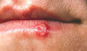 Cold Sore
Cold sore on the lips caused by the herpes virus.
https://www.doctorfox.co.uk/cold-sore-treatments/
 Shingles
Can be on the forehead and eye area and can also be around the waist area and is a fluid filled blister.
http://medicsindex.ning.com/profiles/blogs/is-it-shingles-or-something-else-photos-of-shingles-herpes-zoster
Working on shaping the face

I think in this technical, i need to work on the pace of how i do it and be aware of time, as didnt get to do all of it and what else is i should be more confident in applying these techniques, as if i did it again i would approve the timing and how i applied it.

Wooden stirrer/stick
Kabuki Brush
Foundation Brush
Small rounded end brush

Make Up Studio
Health and Safety
1. Cleansing- Rid of grime and makeup.
2. Toning- Prepares for moisturising
3. Moisturising.
Men-use a tissue to remove makeup, not cotton wool.
Baby buds around the eyes with cleansing.
Towel down before you work on your work place, put kit down on and also what ever makeup you need.
Use brush cleaner in a bowl and only use with all brushes, then use towel roll and wipe them, but should shampoo and condition them every 1 or 2 weeks.
Use sectioning clips to put hair back from face when applying makeup.
Bring shoulder cape to always cover the model up over the clothes.
Always ask if they wear contact lenses.
Dont ask the model if they can get rid of lots of eye makeup themselves.
Ask if they are allergic to anything at all.
With removing makeup use non fragrance remover and hyperalligenic
Always wash hands before anything and always say you are going to.
Monday, 30 November 2015
Powerpoint Presentation of my Make Up design
This is my Powerpoint presentation on the Make up that i sent to my partner and how the design looked like when applied on me and the idea.
How i felt about the application of my design on me
I think the applying of the base was a easy idea, as it was Kryolan Supracolor in white, as i thought this would be easier to apply than the Illamasqua skin base as it can be streaky looking even when buffed in and can crease if not set quick enough, but was good as when put the Illamasqua Powder eyeshadow black on top it didnt come off and it moved how i wanted it to, with the green from the same palette went on good, as is grease as well, my partner made a good job of that and the time management was very good and showed skill of what i wanted to create and changed it slightly, but still looked like what i wanted in the end.
When communicating i think we could have done better, because we didnt get on to well with what we were trying to do and should have practiced more to be more confident in what was happening.


 I think the eyelashes and eyebrows were blocked out very well and made it look more Elizabethan and i find the Kryolan Supracolor make it look much more pale than the other Illamasqua Skin base, The part i like the most is on the neck as it goes thinner and fades as it goes down and gives a nice angle on the neck. The black isnt as blended in on it as i hoped, but where it goes up on to the forehead i like, as it blends in with the hair line. More Kryolan white on the neck would have made the green stand out more though, as it looks slightly odd with very pale skin on my face but the neck is my natural colour, but i could have been more clear in the design idea though.
Tools Used
large and small Foundation brushes
Kabuki Brush
Eyebrow and eyelash wand
Powder Brush
Angled Eye brush
Eyeshadow brush
Concealer brush

When communicating i think we could have done better, because we didnt get on to well with what we were trying to do and should have practiced more to be more confident in what was happening.


Tools Used
large and small Foundation brushes
Kabuki Brush
Eyebrow and eyelash wand
Powder Brush
Angled Eye brush
Eyeshadow brush
Concealer brush

Friday, 27 November 2015
Assessment of my doing my partners design
When doing this i felt i needed more practice on it to have more confidence of what i had to do, but i think i needed more information though as of who to exactly do what she wanted be to achieve, so i wouldn't feel nervous about doing it. When applying the Illamasqua skin base was easy and i did it a lot faster than i usually do and when setting it with the Illamasqua powder, but after that with the Kryolan Supracolor Palette i didn't feel confident and wanted more information written down, as the face chart was done well, i just couldn't tell the skills that were done to create it.
With the blusher from the Kryolan blusher palette was supposed to create the Elizabethan look on the cheek, and then using a lighter fleshy shade from that palette to sweep across from it all the way to the edge of the face, which i think i did well and was better than the practice, but now i know how to do it. I found that i ran out if time, so i had to to the brows and lashes as quick as i could and got some on the makeup as i did so, the lips i found difficult as she wanted reverse Ombre lips, with the skin base around the lips then the dark red from the Kryolan Supracolor, because i had never done it before and looked better than i thought it did, for the first time doing, but was quite messy and wasn't the look my partner wanted. Overall i think better communication between us and more practice would have saved it a bit, but i still feel i did well with the skin base application and powder setting.
 This was the design after the one underneath as this is clearer to understand, with notes, but i still found it difficult to comprehend exactly where the pink on the eyelid ended exactly, but as with timing i didnt get to do the darker brown colour for a contour look, so that was what i could have done better and now i know need better time management with how long to be applying things.

Tools used
Kabuki Brush
Eyelash and eyebrow wand
large and small foundation brush
Small angled eye brush
Powder brush
Lip brush
Blending brush


With the blusher from the Kryolan blusher palette was supposed to create the Elizabethan look on the cheek, and then using a lighter fleshy shade from that palette to sweep across from it all the way to the edge of the face, which i think i did well and was better than the practice, but now i know how to do it. I found that i ran out if time, so i had to to the brows and lashes as quick as i could and got some on the makeup as i did so, the lips i found difficult as she wanted reverse Ombre lips, with the skin base around the lips then the dark red from the Kryolan Supracolor, because i had never done it before and looked better than i thought it did, for the first time doing, but was quite messy and wasn't the look my partner wanted. Overall i think better communication between us and more practice would have saved it a bit, but i still feel i did well with the skin base application and powder setting.


Tools used
Kabuki Brush
Eyelash and eyebrow wand
large and small foundation brush
Small angled eye brush
Powder brush
Lip brush
Blending brush
Monday, 16 November 2015
3rd Design Experimentation

I used Kryolan Supracolor Palette in White and the green was also from that palette and i have buffed it in afterwards, i think it has blended in well and shows the whit base very well. I used Illamasqua Pure Pigment in Obsidian for the eyelids and that so they messy, but then blended at the top.

I want to make it more at a angle so that i can apply it down the neck and i didnt blend the black at the top this time, which i need to do in order to make the design work. On the next experimentation i will include that to show it is not just something random.

I like this side better than the other and i need to work on how messy it is and not all the way down the face, but at a angle.I think the green needs to be blended in more to create a more dabbing motion with a brush on the skin, than like this, as it looks quickly applied.
large and small Foundation brushes
Kabuki Brush
Eyebrow and eyelash wand
Powder Brush
Angled Eye brush
Eyeshadow brush
Concealer brush
Saturday, 14 November 2015
2nd idea proper practice

For the black was Illamasqua pure pigment Obsidian and then Kryolan Supracolor palette in Green, that i have blended in with the black. But the green is supposed to be falling downwards so that it looks like it is coming off. I do need to experiment with it more and see if i can blend the green in more, as it is quite bright.
For it extending to the neck, i need to think about what to do with the pattern of the green on the cheeks, on whether to apply it at a angle going towards to the edge of the face.

With this i need to practice more of how i want the blending to look like and how the texture would look. With the black on the eyelids it needs to be darker and mixed in with the green so it is a darker tone and then into a lighter one, so it starts to fade.

The side is slightly different and it is right all the way under the eye, instead of into the middle, and it is green under there, i want to make it black eye shadow under it. The green needs to be extended all the way down the face, to the edge.
7

Overall i just need to practice it again to make sure it is how i want it and what i want to change about this way of applying it. I like how it looks from the front here, as it is blended very well, but need to work on the when i photograph the sides, they need to look perfect as each other.The green does need to be blended more into the skin, but still dabbed, like it looks like it is falling off.
large and small Foundation brushes
Kabuki Brush
Eyebrow and eyelash wand
Powder Brush
Angled Eye brush
Eyeshadow brush
Concealer brush
Subscribe to:
Comments (Atom)